CASE STUDY
Provider Portal (symplr)
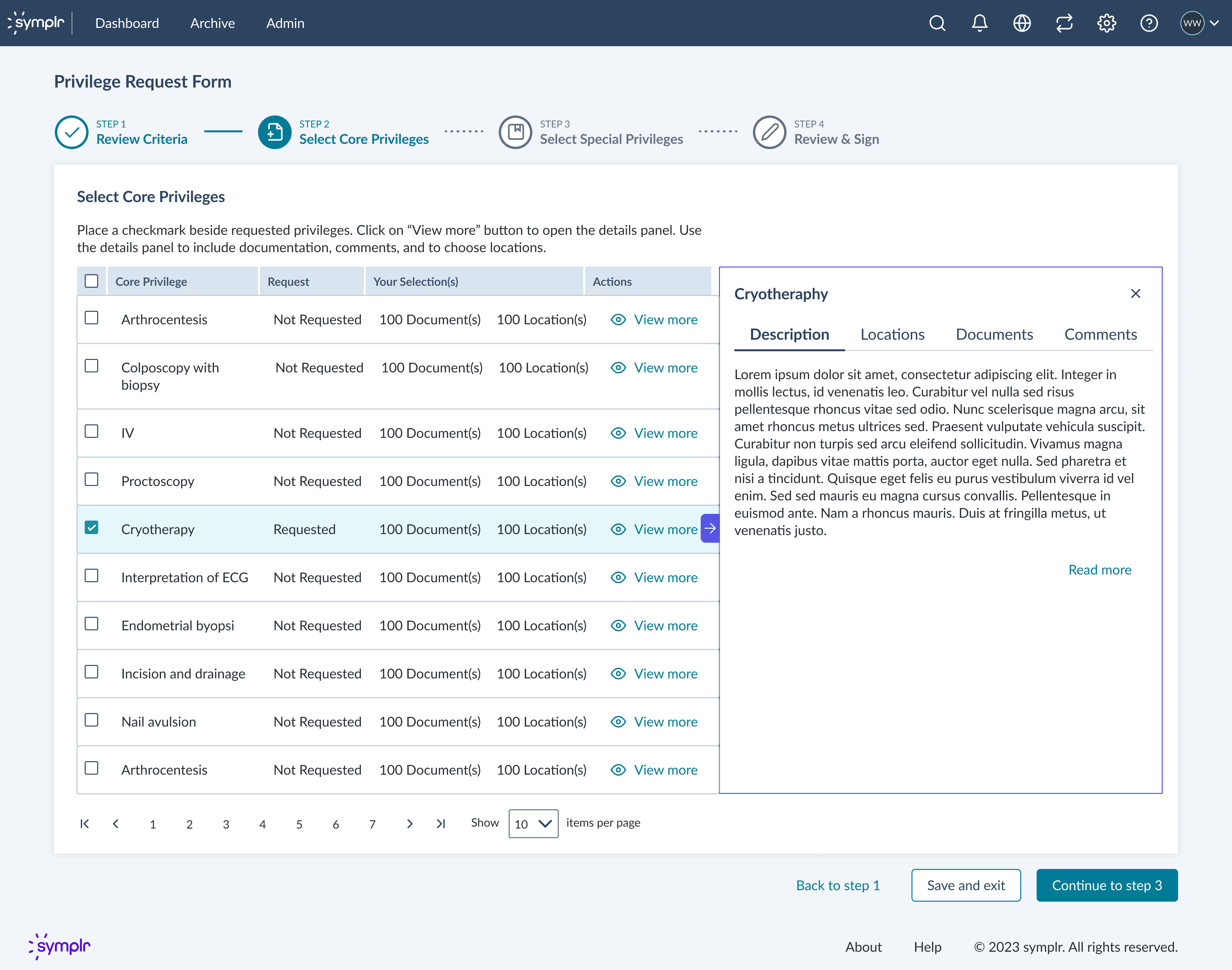
Reducing cognitive load in a high-stakes credentialing workflow by designing clearer task flows, better status visibility, and calmer “what happens next” moments.
ROLE
Senior UX Designer / Researcher
USERS
Providers · Credentialers · Schedulers
CONSTRAINTS
Complex data · strict rules · low patience
OVERVIEW
What this was
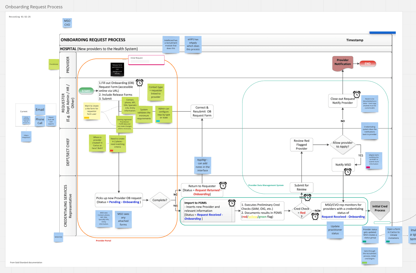
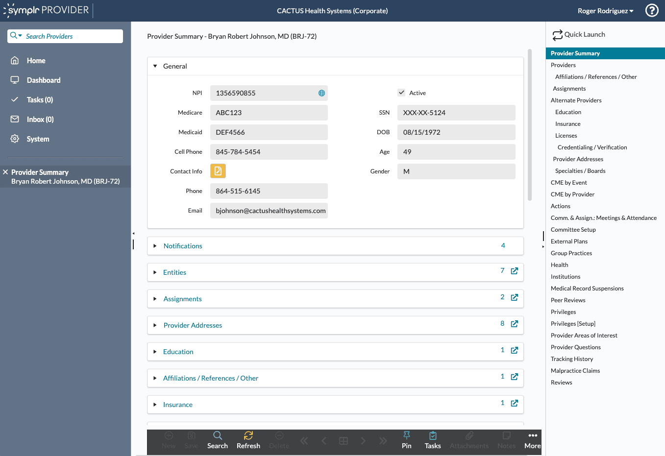
The Provider Portal supports credentialing and related workflows that determine whether a provider can practice, where, and under what conditions.
The work centered on clarity: making the system legible when stakes are high and information is dense.
THE PROBLEM
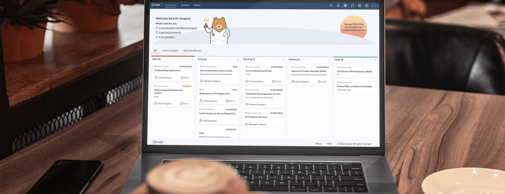
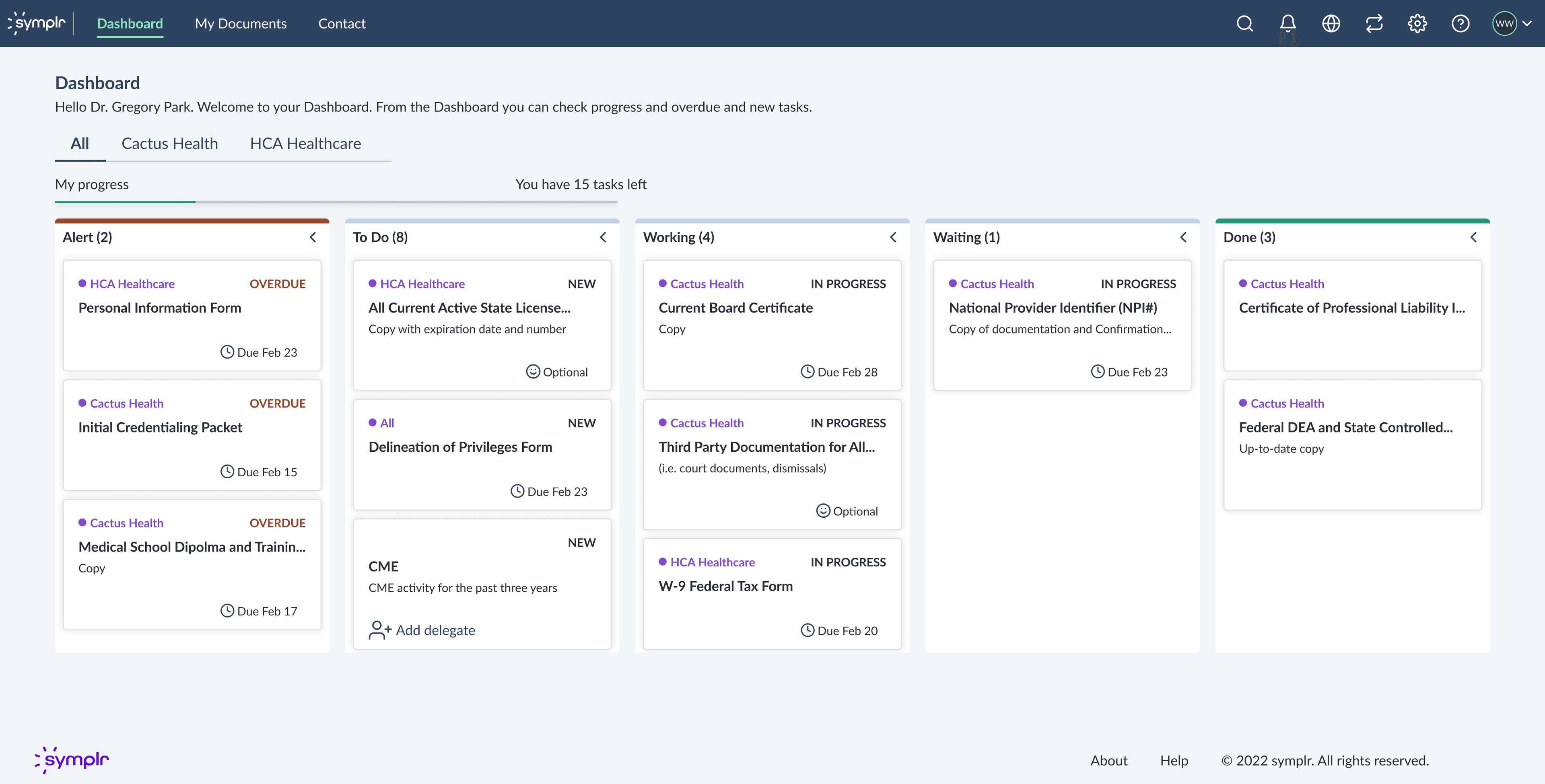
Where people got stuck
- Status uncertainty: “Did it submit?” “Is it pending?” “Who owns the next step?”
- Data density: tables and documents without strong hierarchy.
- Workflow ambiguity: multiple paths, inconsistent language, and surprise requirements.
These weren’t “UI issues.” They were trust issues. Confusion creates delays, rework, and support load.
APPROACH
How I worked
I combined qualitative signals (where people hesitated, asked for reassurance, or escalated) with product constraints (policy, engineering realities, and legacy patterns).
- Mapped “anxiety spikes” to specific steps and screens.
- Defined crisp job stories for each role: provider, credentialer, scheduler.
- Focused on a small set of repeatable improvements: information hierarchy, next-step clarity, and error recovery.
THE SOLUTION
What changed
The solution was a set of upgrades that made the system behave more predictably in messy reality.
- Clearer status language and “what happens next” guidance.
- Better scanning: stronger type hierarchy, grouping, and labels.
- Reduced cognitive load by moving from “everything everywhere” to “what matters now.”
- Guardrails for edge cases: incomplete info, rejected items, resubmission flows.
IMPACT
What improved
- Fewer “where am I?” moments. Clearer ownership of next steps.
- Better scanability in dense views (faster orientation).
- Less rework from missed requirements and unclear states.
LEARNINGS
What I learned
In regulated systems, good UX is often less about delight and more about reducing ambiguity.
When the UI makes responsibility and next steps explicit, people don’t just move faster. They feel safer.
NEXT
What I’d do with more time
- Instrument the “trust moments” (confusion, consent, repair) as measurable signals.
- Expand pattern coverage across adjacent flows (documents, verification, escalations).
- Formalize reusable guidance into a lightweight system or token-like library.