JustOneCall
Lowering the activation energy for civic action by turning “I should do something” into one clear call, with calmer scripts, address-based routing, and shareable issue pages.
This project centers real-world events. The UI is designed to support action without sensationalism.
What this was
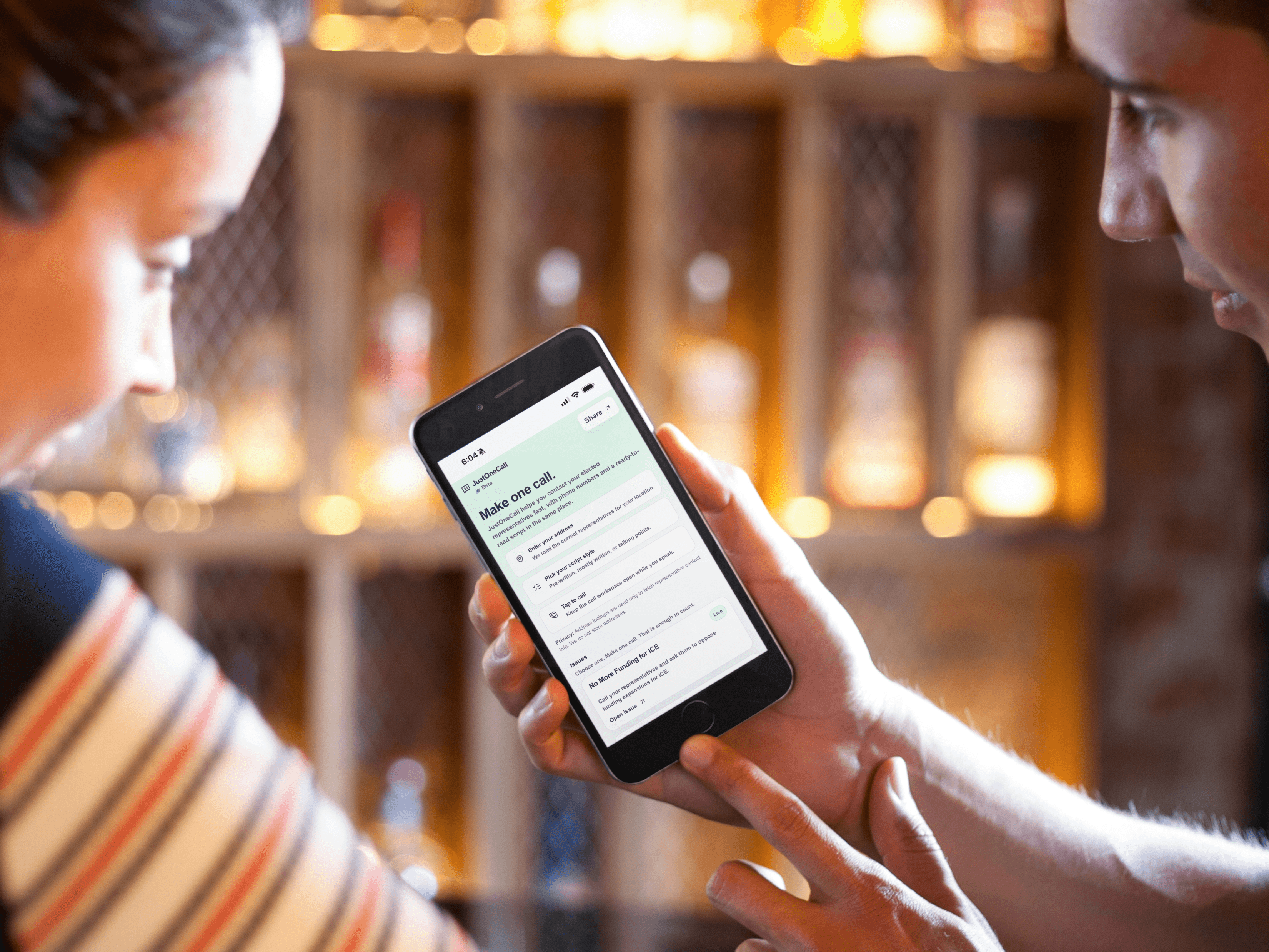
JustOneCall is a mobile-first civic web app that helps people contact their elected representatives quickly and clearly.
The core design goal was restraint: remove unnecessary choices, reduce anxiety, and keep the experience honest about what a call can and can’t do.
Where people got stuck
- Orientation: “Who do I contact? Federal? State? Local?”
- Language fear: “I don’t want to say the wrong thing.”
- Time scarcity: “I have two minutes.”
- Emotional overload: anger, grief, and anxiety spike right before action.
These weren’t motivation issues. They were workflow issues.
How I worked
I treated this like a high-stakes workflow, not a content site.
- Mapped the anxiety spikes: where people tend to freeze, abandon, or delay.
- Designed for clarity under pressure: plain language, obvious next steps, low visual noise.
- Avoided performative patterns: no “engagement loops,” no dark-pattern urgency, no guilt funnels.
What changed
The solution is a compact system that turns “I should do something” into one contained action.
- Address-based routing: find the right representative without making the user research.
- Issue summary + sources: enough context to speak confidently, without overwhelming.
- Call sheet: a single screen that supports dialing, reading, and staying steady.
- Shareable issue pages: built for fast spread without requiring repeat explanation.
- Ethical constraints: honest language, careful sourcing, and no sensational UI.
What improved
- Lower abandonment once users selected a script style.
- People reported feeling less nervous and more grounded before dialing.
- Clearer expectations reduced the sense that civic action must be perfect to count.
What I learned
In civic moments, clarity is compassion. People don’t need louder calls to action. They need quieter instructions and dignity in how they’re asked to participate.
Design isn’t neutral when stakes are human. It either helps people act, or it teaches them to look away.
What I’d do with more time
- Multilingual support and clearer plain-language QA.
- Image-based sharing (downloadable share cards with a link).
- Formal accessibility testing across screen readers and voice control.
- A lightweight issue template so trusted groups can launch responsibly.